Preface
Today’s pharmaceutical and biotech industries are globally searching for optimization of product release time while parallel improving product development costs.
The pharmaceutical industry in general and the fast-growing biotech industry, all dealing with very urgent product developments, require the efficient use of the best enabling technologies.
The digital quality platform combines data from processes, quality and scientific date into one single place of truth. Within the framework of the digital quality platform, data from the development laboratories, production process data and associated quality data are analyzed. As a result, critical process parameters and their influences on the important quality attributes are efficiently identified.
Consequently, a shortening of the development time in pharmaceutical and biotechnological development, through a dramatic reduction of physical laboratory tests and the associated high costs, becomes possible.
The following article deals with two main challenges and the methods used for them in product development.
Process analytical technology (PAT) is used to design, analyze and control product development processes. The goal is to identify all critical process parameters (CPPs) and quality attributes (COAs). On the way to this goal, the collection of the underlying data from in- and online analytics and their well-founded analysis is indispensable. A perfect PAT environment is the basis of any optimization project and at the same time the source of all future continuous improvements.
Quality by design (QbD) targets a guaranteed quality for product developments. QbD methodology leads efficient to predict quality attributes through mathematical models instead of conducting physical tests and measures. The perfect approved QbD will save resources, reduce time to market and make processes in general more efficient.
For more information on PAT and QbD, visit ispe.org, ich.org, or fda.gov.
In the following session, we would like to use practical examples to show how the digital quality platform supports you in your entire product development process.
The following source information represents in- and on-line analytics data as the starting point for our use case: Laboratories, Suppliers, APIs, Formulations, Production processes, Batches, Process data and Data from different source like ERP-, MES-, LIMS-, EM-, QM- and PLC-Systems.
PlanNow Analytics Suite
Let’s jump directly into the PAT and QbD use case.
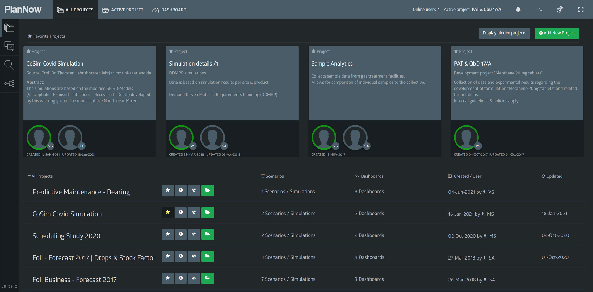
At first, we see a list of available projects to choose from. Projects provide the means to easily group topics/tasks and teams. For this workshop, we will open the “PAT & QbD” project.
Case overview
First, we want to provide an overview of the process and model that we will see.
The screen below shows the “case overview” dashboard, at which we will look more closely.

The widget in the top left corner shows a visualization of the production process to produce the tablets.
In this workshop, we are looking at the development of a new formulation: “Metabene 20mg tablets”.
Metabene is the fictional drug (API) we chose for this example case.
On the map widget, we can see three laboratories:
- France (FR3X)
- The Netherlands (BNL5)
- Germany (DE04)

Clicking the pie chart allows us to filter just the German lab.


Project overview
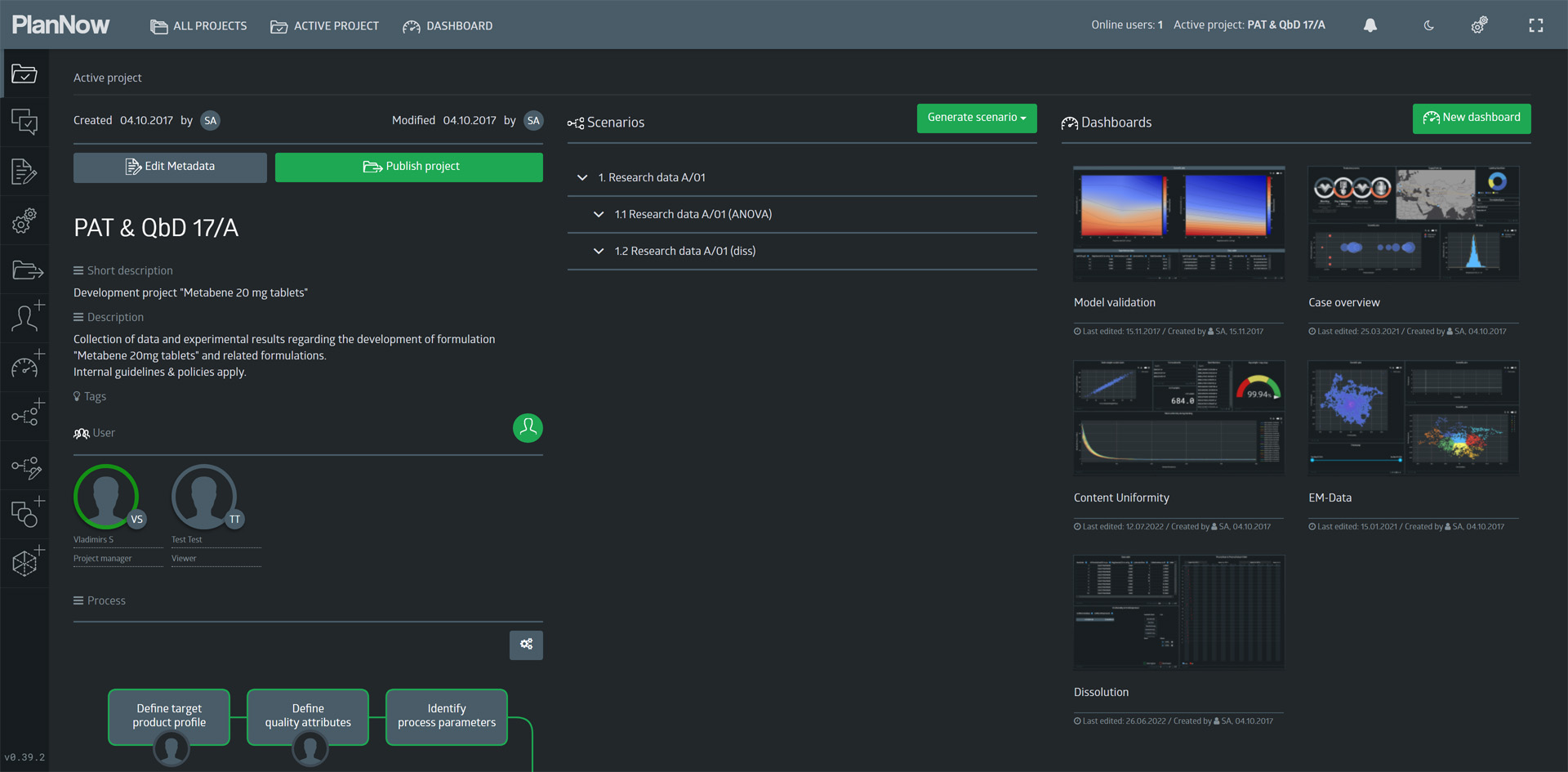
From the dashboard, we navigate back to the project overview page and take a look at the different elements on here.


Content uniformity
Next, we will look at the “Content Uniformity” dashboard.
Content uniformity is affected by the blend uniformity of the blend in the first step of the process. Blend uniformity is measured by a near infrared spectroscopy probe (NIRS). We can see the measurements in the lower half of the dashboard.
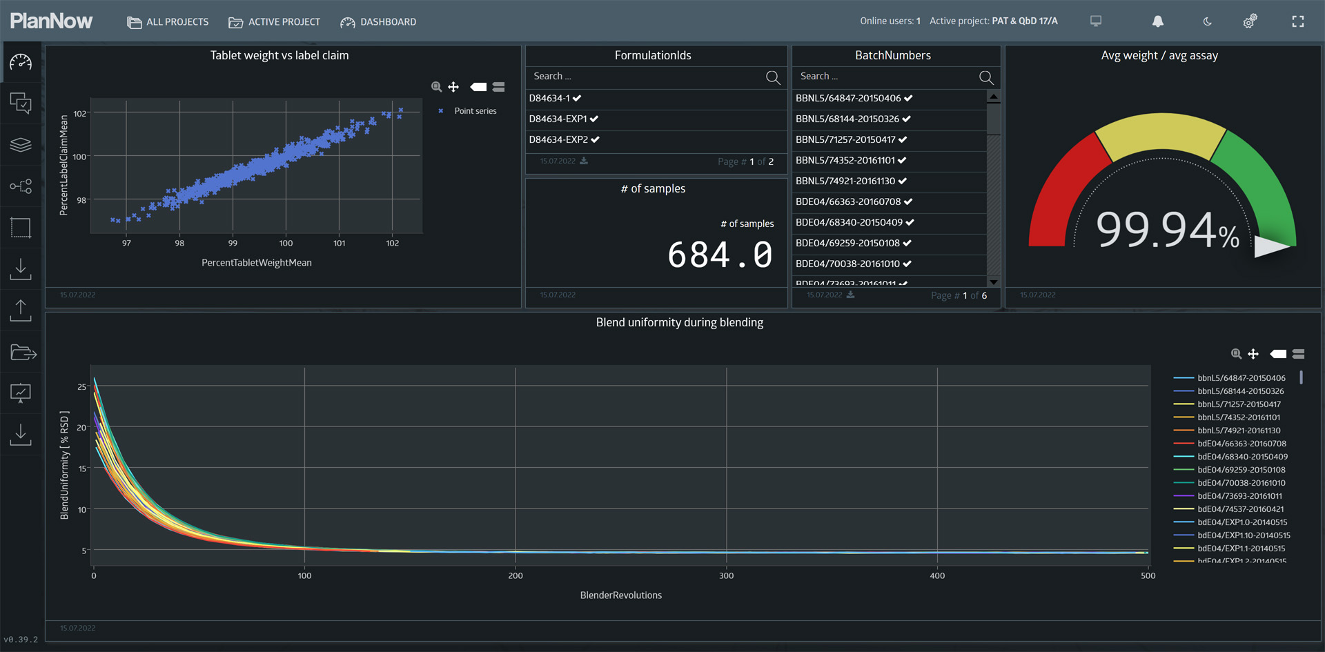

The Y-Axis displays the label claim (% of target assay, in our case 20mg).

Regression
As we can see, there seems to be a linear relationship.
This implies, that if a tablet weighs 103% of what it is supposed to weigh, it likely also contains 103% of the API it is supposed to contain.
To emphasize this, we can use the configure widget dialog to add a calculated regression line, as you can see in the video below.
When we control the blend uniformity with the NIRS probe to make sure it is in an acceptable range, the tablet weight can be used to predict the critical quality parameter assay.
Dissolution (DoE)
Going back to the project view, we now want to look at the experimental design and results regarding tablet dissolution (another CQA). We will open the “DOE – Dissolution” dashboard and take a look at the parameters used in the design and how the experiment was carried out.
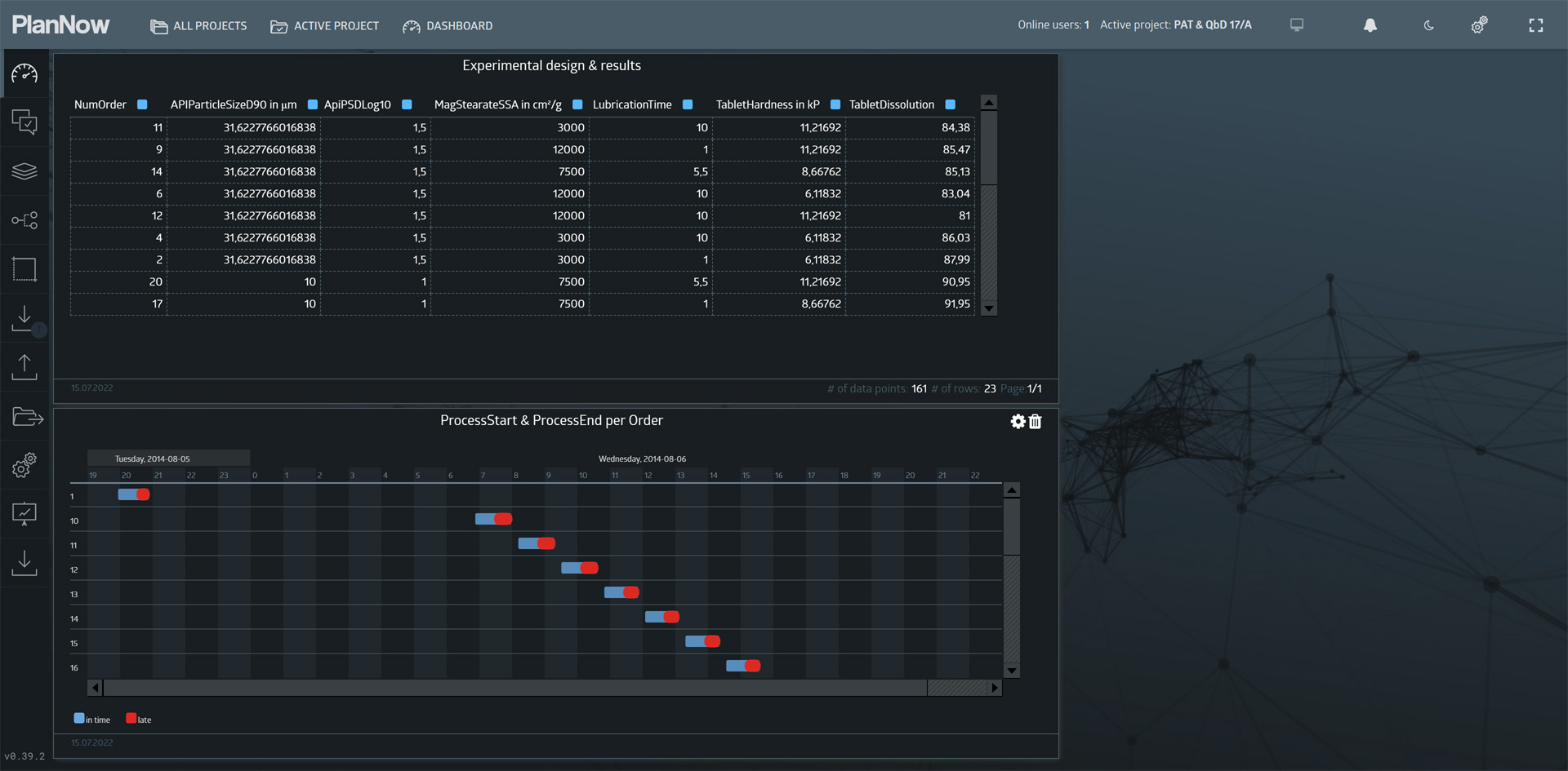
- API particle size
- Magnesium stearate surface area
- Lubrication time
- Tablet hardness
The measured results was Dissolution (% after 20 mins).
The goal of the experiment was to determine which of the parameters affect the COA dissolution. Furthermore the results will be used to model the relationship mathematically. The image slider below details the experimental design.
ANOVA
Next, we want to find out, which factors affect the outcome. To do this, we can run a analysis of variance (ANOVA) on the experimental results. To do so, we must create a new scenario using a simulation method.

“Look at how API (particle size), SSA (magnesium stearate surface area), LubT (lubrication time) and Hard (tablet hardness) affect Diss (tablet dissolution)”.
After the simulation finished and the new scenario is available, we want to switch it with the old scenario in our existing dashboard.

The data a dashboard visualizes depends on the connected scenario(s). Scenarios are dynamically linked to the dashboards and the user can control which data they want to visualize. Dashboards in PlanNow Analytics Suite are always just “templates” for the visualization. The data context (scenarios) backing them can change and it will automatically update.
ANOVA results
With the new scenario in the dashboard, we can take a look at the results in tabular form.

A table is a good tool for a deep dive into the data, but for now we need a straightforward visual representation of which factors are significant.

To filter out the values that are not significant, we can use a measure filter on the p-value.


- API particle size
- Lubrication time
- Tablet hardness
- MagSt surface area
- (MagSt surface area) x (lubrication time)
Simulation method
Using the insights we gained from the experiment and the analysis of the results, a simulation method was developed. lt features a mathematical model for calculating the dissolution using the significant factors we determined earlier.
Here we can pick a range of values for which the experiment should be simulated.


Simulation results
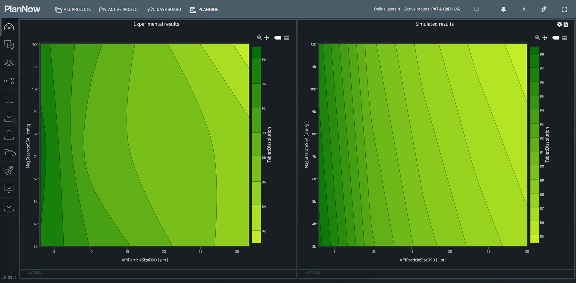
lf we compare the original experimental results to the new scenario containing the simulated results, we can see the extended range of values.
Conclusion
Using the mathematical model, it is possible to extrapolate the findings of the experiment to ranges that were not tested.
This is only a small fraction of what can (and should) be done in a project like this, but we hope it gave you a glimpse into what the PlanNow Analytics Suite can do.
Stay ahead of your competition!
Address
Augustaanlage 32
68165 Mannheim
Germany
