Preface
Predictive maintenance is fundamental to Industry 4.0. The possibility to process IoT data in real time and run machine learning algorithms to predict to optimal maintenance time is a very valuable. Predictive maintenance helps you make better use of your resources and thus increase your productivity. This gives you an advantage over those who still perform preventive maintenance.
As digitization continues, it also becomes increasingly important to unleash the value of data science. With our data science and machine learning (DSML) platform it is possible to make data science easier and faster useable. This gives our customers an advantage over their competitors who must invest heavily in implementing new data science approaches.
In this case study, we will show you how you can use PlanNow Analytics Suite to collect your data from your assets and analyze it automatically at regular intervals.
Case overview
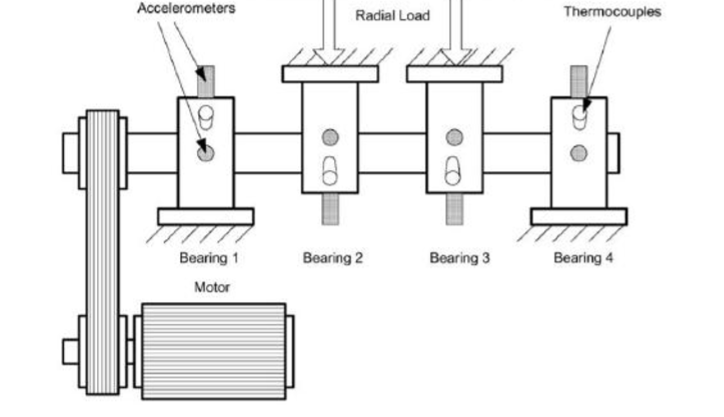
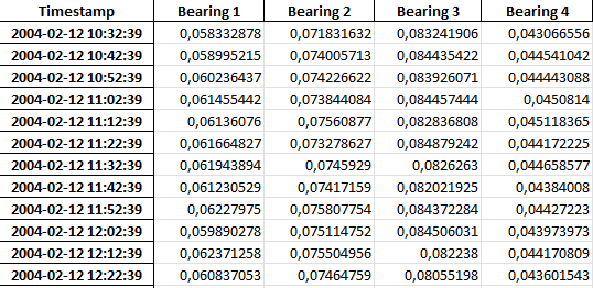
Let’s take a look at the initial situation.
Model
Let’s bring the data into PlanNow Analytics Suite. First, we need to create a model, which contains the whole structure of our data.
A model has three important layers. The first layer is the “Importer” where the sources of the data are defined. There, data from many different sources can be loaded into one single model. You can import data from Excel files, CSV files, Microsoft SQL databases, MySQL databases, RESTful APIs, SAP systems and PLC (OPC UA) systems.


The last layer is a sort of cache, it’s called “Datasources”. Here we can process the data for dashboards. It makes sense here to combine tables that belong together or to perform some analyses in R. This makes the work in dashboards much easier and gives us more possibilities.
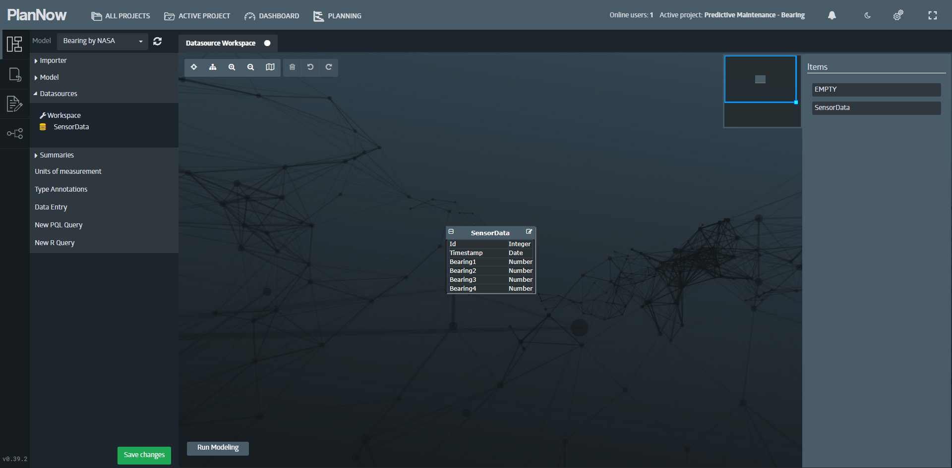
We have successfully created a simple model which now can be used to create a scenario.
Predictive Maintenance
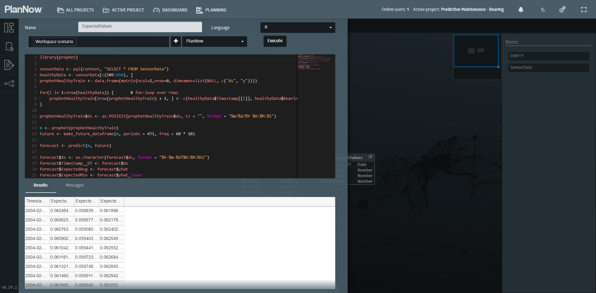
So, we want to predict the maintenance of our asset based on the measurements. As you may have already seen in other case studies, there is the possibility to define simulation methods on the platform and to equip them with input masks for parameters. However, in our machine learning model, we will not have parameters and the simulation method would have to be run manually.
In this case we’ll take advantage of the opportunity we have to integrate R code into the “datasource” layer of our model. This way, the machine learning model will automatically run every time data is imported or a scenario is modified. Let’s create a new table called “ExpectedValues”, select “R” as the language and write the code for our machine learning model:
Analysis
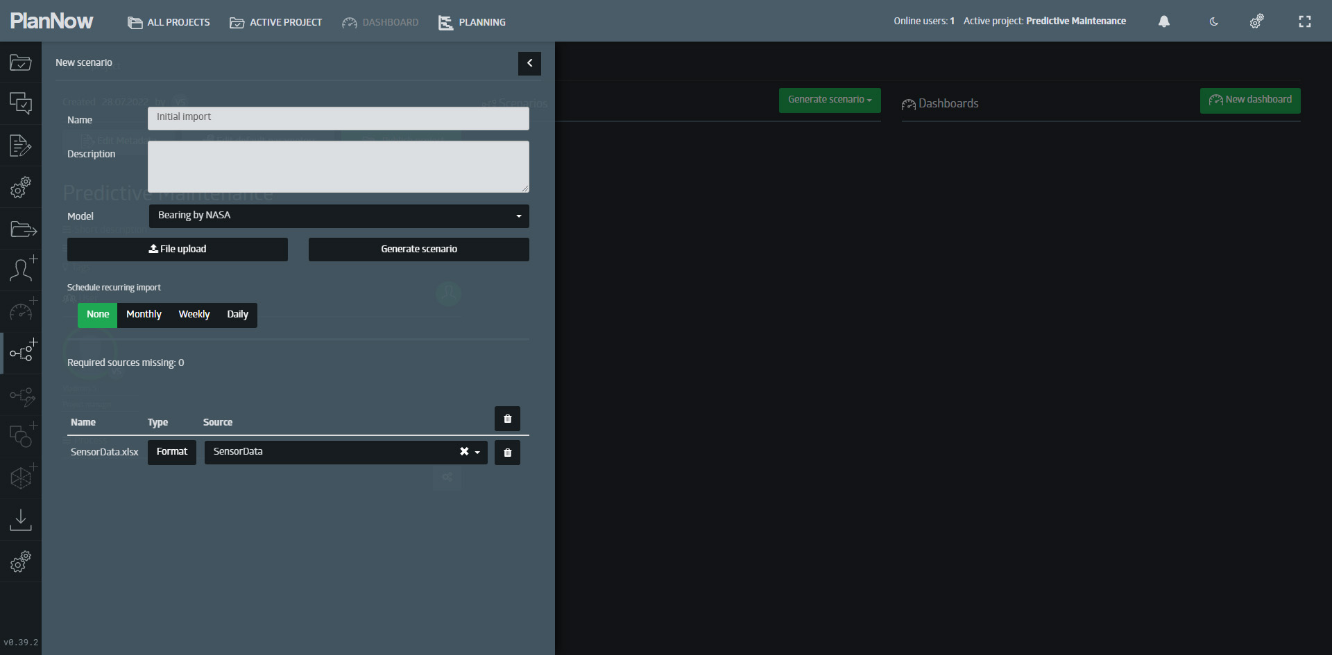
Let’s create a scenario and look on the data.
We have built up a small dashboard to visualize the source data.
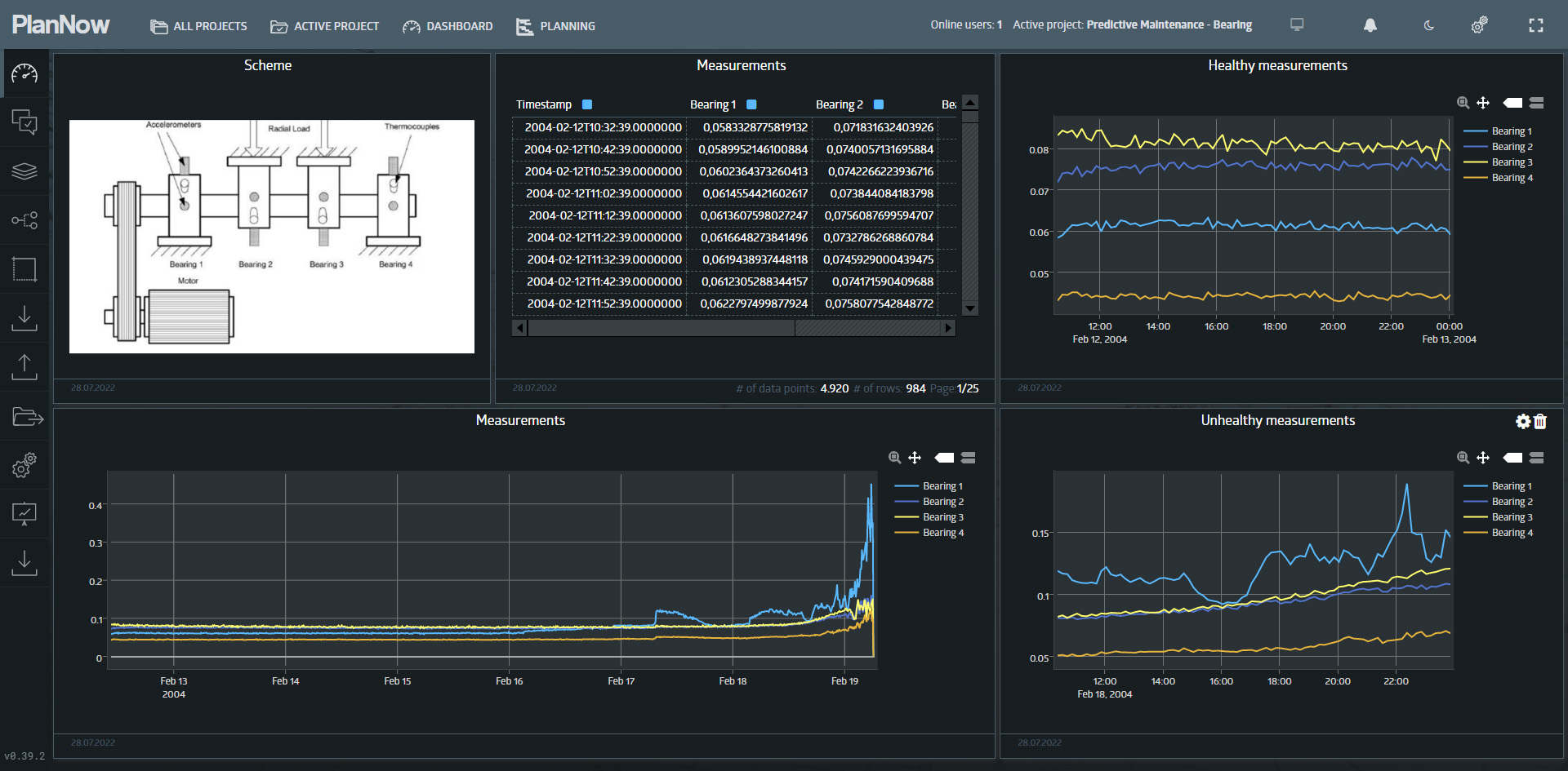
The upper right line chart shows healthy measurements, and the line chart below shows unhealthy measurements.
So, let’s create a new dashboard and take a look at the predictions we have calculated.
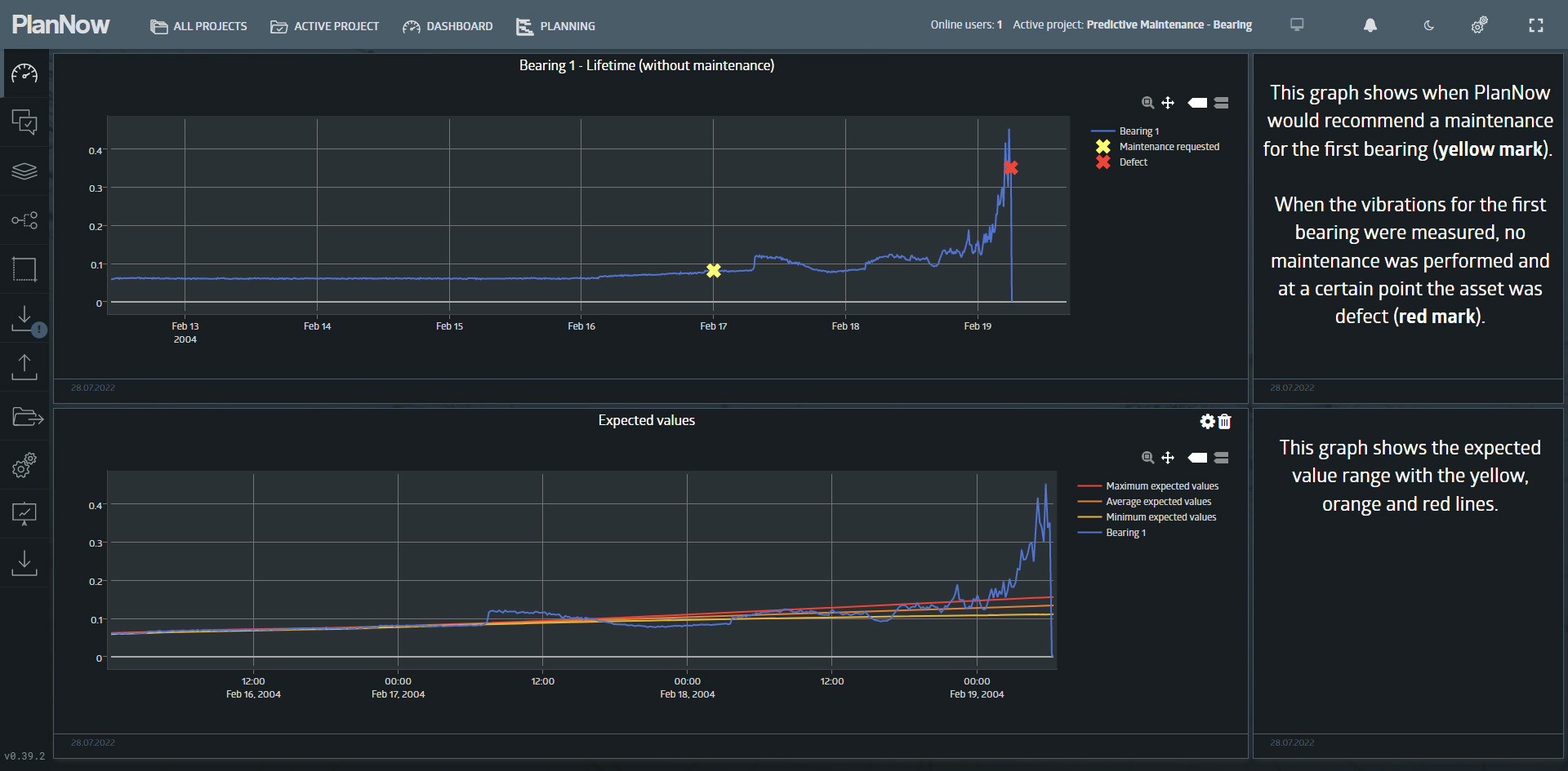
The upper left widget shows the measurements of the first bearing with the blue line. The yellow mark is the point where the machine learning model would suggest a maintenance and the red mark is the point where a defect has occurred, due to maintenance not being performed.
Summary
We’ve shown you in this article how easy it is to integrate your existing assets into our platform and analyze their data on an ongoing basis. You also can configure notifications in your model that inform you about suggested maintenance when it is required.
Switch from preventive maintenance to predictive maintenance now and you’ll increase productivity. Get ahead of your competition by using data science and machine learning (DSML) tools more easily and quickly. Feel free to contact us to get access to our pioneer platform now.
Stay ahead of your competition!
Address
Augustaanlage 32
68165 Mannheim
Germany
